
Information architecture & menu redesign for vendor administration panel
MY ROLE
UX/UI Designer
SCOPE
July 2021 – August 2021
TOOLS
Figma
Project overview
Wedding Dream is a Polish company from wedding industry. One of the company’s projects is the Company Directory, a website that brings together service providers from the industry and allows them to present their offer to potential customers. To do so, they must create an account on this website, complete the necessary data related to their offer and the company provides them with its platform. The place where users complete information about their offer is the vendor admin panel. This case study shows the process of creating an information architecture and menu in this panel.
Problem statement
The project of reconstructing and redesigning the admin panel is a very extensive process. The previous admin panel was too complicated and the information was sorted randomly, causing users to get lost and a high percentage of incomplete profiles appeared. In addition, customer service has received many messages that users are unable to navigate the layout, which is why they do not use the service.
The main objectives of the project were to change the graphical interface of the application, but after the audit of the panel and the research of the customer service, we decided to start creating the information architecture of the panel and consequently to change the layout of the menu.
Understanding the user
Target group users are people working in the wedding industry. In interviews with users, we learned that such services are an additional place for them to present their offer but they prefer to present themselves in social media. This doesn’t change the fact that they want to use these sites for marketing purposes, but during their work they don’t have much time to complete their profiles. They expect a simple system in which all the information is easy to find, as it is only one of many places where they present their offer, and they have many other daily tasks associated with their work.
Solution (What I did and why?)
The first phase of the project involved analysing the existing panel and gathering information on the features and website that are already operational. This analysis revealed that the panel elements are randomly arranged and that there are too many menu items. This leads to users being lost and overwhelmed with content. Although the panel has many functions, splitting each of them into a separate subpage is not necessary and should be grouped so that similar elements can be placed in one place.
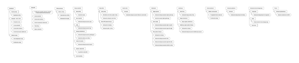
Therefore, the information architecture was first developed. It contains all the elements of the admin panel, starting with the login page, the registration, the onboarding of a new user, all the pages in the admin panel with their functions. As already mentioned, the new information architecture has been designed to minimise the number of subpages and combine similar functions.
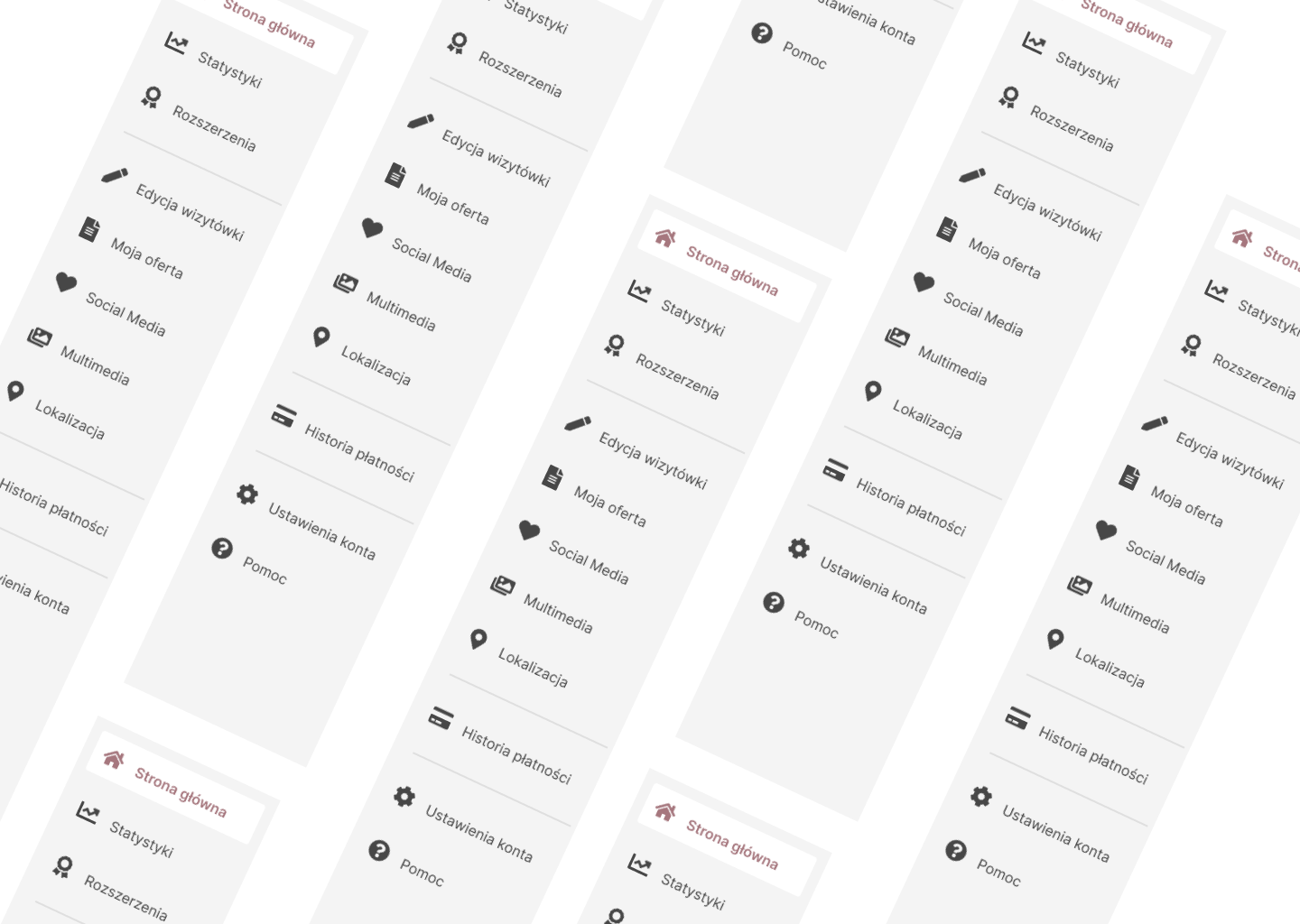
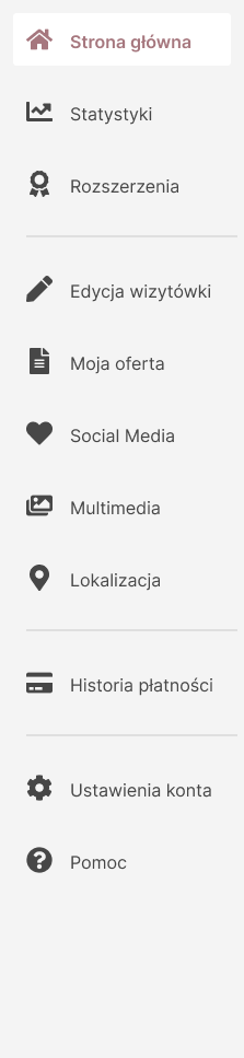
Based on the information architecture, a new menu and dropdown of the user was created in the panel. Even the information architecture enabled a clearer display of the contents, but the menu requires an appropriate arrangement. Creating a content hierarchy is an important element, as you have to decide which features are most important for the user and then place them in the menu on that basis. Creating a clear and intuitive vendor panel is also important from a business perspective, because the presentation on the company’s website depends on whether users fill in data and supplement their offers.
The menu is divided into 4 parts, each covering a different area. The first part includes the user’s Home screen, Statistics and a Paid promotion. This is an important part from a business perspective, as the panel users want to run their own businesses in order to achieve the best results by presenting their offer and thus have easy access to precisely that information. On the statistics page, the figures of their offer are visible so that they can decide what they can do better and whether they are satisfied with their results. The paid promotion page allows you to buy different types of extensions, and they can only make their purchase decision after checking the statistics. The second part includes pages that are linked to the addition of the user offer, i.e. the Setting of the business card, My offer, Social media settings, Multimedia and Localization. With all these form pages, users show their offer to potential customers. The next menu item is the Payment history and Payment settings. The last section contains the Account settings and a Support request form. These are purely technical elements that are not linked to the offer, which is why they have been placed at the bottom of the content hierarchy, but they are also easily accessible to users.
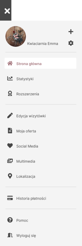
In addition, a dropdown has been placed in the header, where items related to the change of account (the user can add more than one offer), and as in the last part of the menu – the account settings, the help form and the “Logout” button have been placed.