

Landing page redesign
MY ROLE
UX/UI Designer
SCOPE
October 2021 – November 2021
TOOLS
Figma
Project overview
Wedding Dream is a Polish company from wedding industry. One of the company’s projects is the Company Directory, a website that brings together service providers from the industry and allows them to present their offer to potential customers. To do so, they must create an account on this website, complete the necessary data related to their offer and the company provides them with its platform. The redesign of the landing page for wedding companies was implemented as part of a redesign project for the entire platform.
Problem statement
The aim of the project was to redesign the website for wedding companies to encourage them to register in the company directory. The previous version of the site was low in content – it did not contain a lot of important information for users that are benefits of the site and might encourage them to sign up. The main idea of the website redesign process was to show the main benefits of registration in the simplest way, to show how easy the platform is to use, and to communicate transparently the possibility of paid promotion according to business assumptions – users decide for themselves whether to use the paid offer and select all parameters themselves. The project was designed for both desktop and mobile devices.
Understanding the user
Target group users are people working in the wedding industry. In interviews with users, we learned that such services are an additional place for them to present their offer but they prefer to present themselves in social media. This doesn’t change the fact that they want to use these sites for marketing purposes, but during their work they don’t have much time to complete their profiles. For them, it is important that account management is as simple as possible and that the company does not charge any hidden costs, as the wedding industry suffered financially during the pandemic and they do not want to spend a lot of money on additional online advertising.
Solution (What I did and why?)
The previous version of the landing page was very poor in information and did not show all the possibilities and benefits of registering in the system. As it turned out, the service meets many of users expectations, but they have no way of getting information about it. During the planning process, we have focused on what is most important to them, and we have presented each of these elements in a separate section so that all the information is readily available. The order of the sections is a consequence of the user’s expectations. These are sequentially:
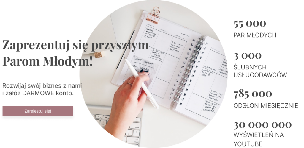
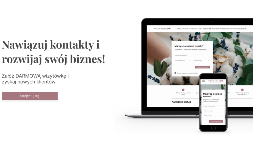
1. Hero section with CTA – The first section contains promotion header with CTA button – register. The section also includes relevant photo and numbers that show the popularity and efficiency of the website.
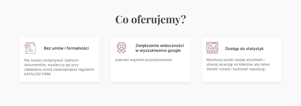
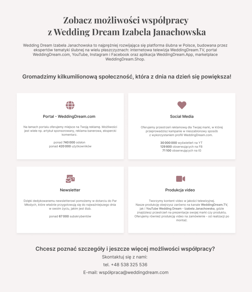
2. What we offer? – The next section describes the main benefits of joining the company register. It allows the user to become more familiar with what the service offers.
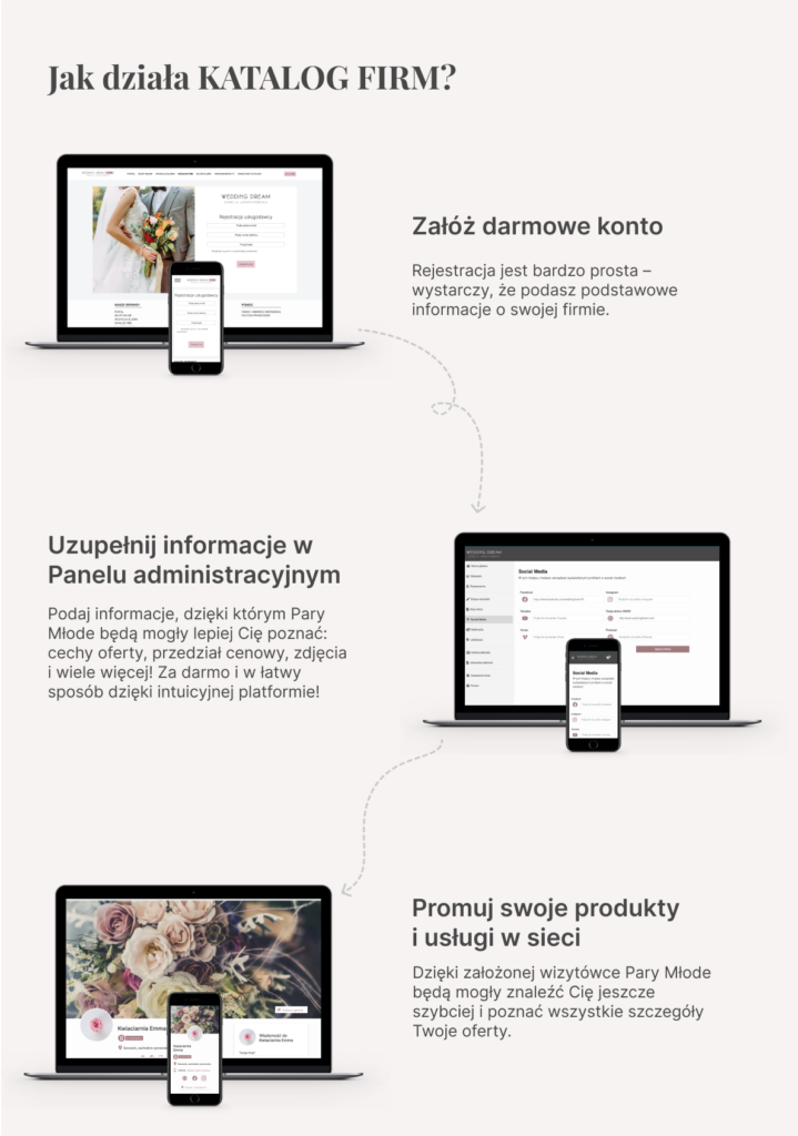
3. How it works? – This section describes the steps that a user must take in order to present their offer on the Website. It shows how easy the platform is to operate and how little work it takes to present an offer. Important elements of the offer that the user can present are also placed here.
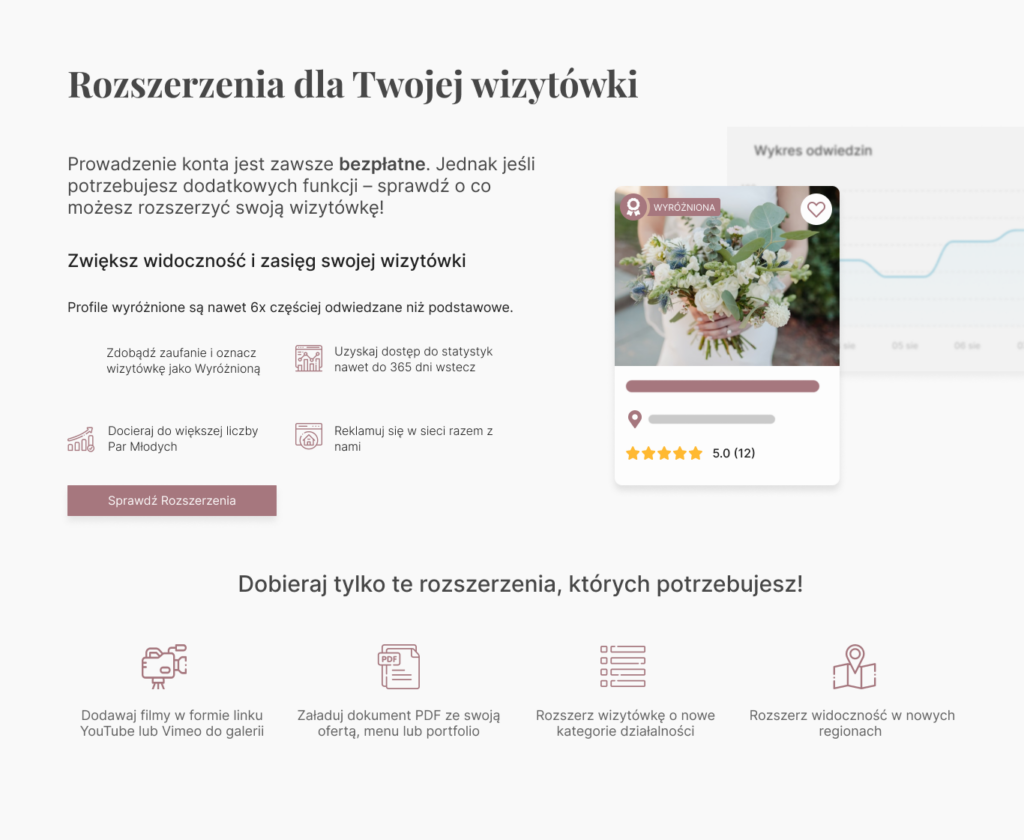
4. Paid promotion – The service also features a wide range of enhancements that allow companies in the wedding industry to add more elements to their offer or enhance the display. However, it is important that the service does not charge a fixed fee, and users select additional items according to their needs and decide for themselves whether and which items they need. That’s why it was important to show on the landing page that the purchase of an offer is optional and the company does not charge any account maintenance fees.
5. Additional personalized offer – The company also offers a number of personalized advertising options outside the company directory. They have been placed on the landing page to show how much advertising the company offers, which can be encouraging for potential users.
6. Summary – Closing section in which there is also a CTA button that invites users to register. After viewing the entire offer, you don’t have to go back to the top of the page to create an account.
The site also contains relevant visual elements – icons and photos that match the theme of the site and explain how the system works.